“Leaked” Iranian Nuclear Bomb Graph Adapted from Internet Article
Iranian Bomb Graph Appears Adapted from One on Internet
By Gareth Porter – 13 December, 2012 – IPS
WASHINGTON, Dec 13 2012 (IPS) – The suspect graph of a nuclear explosion reportedly provided to the International Atomic Energy Agency (IAEA) as evidence of Iranian computer modeling of nuclear weapons yields appears to have been adapted from a very similar graph in a scholarly journal article published in January 2009 and available on the internet.
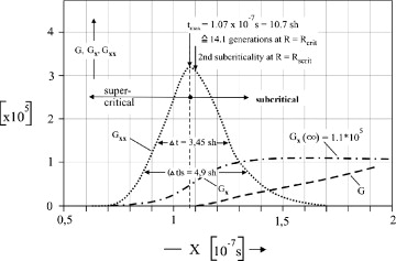
Graph published by the scholarly journal Nuclear Engineering and Design, Volume 239, Issue 1, January 2009, Pages 80–86.
The graph, published in a Nov. 27 Associated Press story but immediately found to have a mathematical error of four orders of magnitude, closely resembles a graph accompanying a scholarly article modeling a nuclear explosion. It provides a plausible explanation for the origins of the graph leaked to AP, according to two nuclear physicists following the issue closely.
The graph in the scholarly journal article was well known to the IAEA at the time of its publication, according to a knowledgeable source.
That means that the IAEA should have been able to make the connection between the set of graphs alleged to have been used by Iran to calculate yields from nuclear explosions that the agency obtained in 2011 and the very similar graph available on the internet.
The IAEA did not identify the member countries that provided the intelligence about the alleged Iran studies. However, Israel provided most of the intelligence cited by the IAEA in its 2011 report, and Israeli intelligence has been the source of a number of leaks to the AP reporter in Vienna, George Jahn.
Graph published by the Associated Press on Nov. 27, 2012, reportedly as evidence of Iranian computer modeling of nuclear weapons yields.
The graph accompanying an article in the January 2009 issue of the journal Nuclear Engineering and Design by retired Swiss nuclear engineer Walter Seifritz displayed a curve representing power in a nuclear explosion over fractions of a second that is very close to the one shown in the graph published by AP and attributed by the officials leaking it to an Iranian scientist.
Both graphs depict a nuclear explosion as an asymmetrical bell curve in which the right side of the curve is more elongated than the left side. Although both graphs are too crudely drawn to allow precise measurement, it appears that the difference between the two sides of the curve on the two graphs is very close to the same in both graphs.
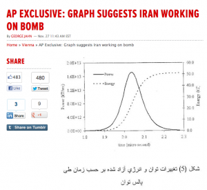
The AP graph appears to show a total energy production of 50 kilotonnes taking place over about 0.3 microseconds, whereas the Seifritz graph shows a total of roughly 18 kilotonnes produced over about 0.1 microseconds.
The resemblance is so dramatic that two nuclear specialists who compared the graphs at the request of IPS consider it very plausible that the graph leaked to AP as part of an Iranian secret nuclear weapons research programme may well have been derived from the one in the journal article.
Scott Kemp, an assistant professor of nuclear science and engineering at the Massachusetts Institute of Technology (MIT), told IPS he suspects the graph leaked to AP was “adapted from the open literature”. He said he believes the authors of that graph “were told they ought to look into the literature and found that paper, copied (the graph) and made their own plot from it.” …more










Add facebook comments
Kick things off by filling out the form below.
Leave a Comment